Dartmouth Student App
Company
Seabird Apps
Role
Product Designer
Duration
3 months
Tools
Figma, Sketch,
Illustrator
Context
Dartmouth has a large number of student resources which are poorly centralized (e.g., schedule, events & calendars, cafeteria menus). Because of this, students have a difficult time accessing all of the resources they need.
The Goal
Our goal was to centralize important student resources into one easy to use app for all needs.
Easily navigable: make the app feel like a cohesive whole that is easy to find necessary information. Currently, all information and content is disparate, making the app feel disconnected and cluttered.
Tailored experience: make the experience customizable in order to cater towards specific needs of each user (e.g., students, alumni, faculty, etc.). Different users look for different categories to define their Dartmouth experience.
User research
User personas
Because of the diverse set of individuals who would use the application, we created personas to better understand the needs of each user. For example, a new college freshman trying to navigate Dartmouth for the first time would engage with the app much differently than a college senior who has a lot under their belt already.
User interviews & Insights
After conducting a series of user interviews, we found a couple of common threads across all:
Differing priorities across students: when prompted for “major categories” that make up the user’s Dartmouth experience, we received vastly different results. Some users cited “outdoors, social, events,” while others mentioned “academics, food, schedule.” The differences reflect the diversity on campus, highlighting the need to provide tailored experiences.
Frustration with lack of centralized resources: students dislike the fact that all resources are scattered across various locations, making it difficult to access key information conveniently.
Importance of streamlined experience: the old Dartmouth app lacked hierarchy and order - all resources were scattered with no rational for which category (e.g., food, schedule) came first. One student cited “there’s no reason to interact with this clutter, so I choose not to.” Despite the fact that students want to have a “one-stop-shop” for resources, it is critical to present the information in a digestible and intuitive manner.
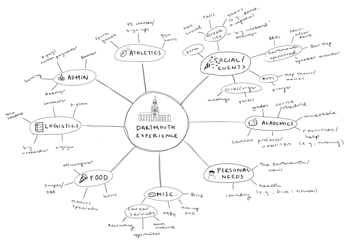
dartmouth experience “categories”
Through our user interviews, personas, and focus group brainstorming sessions, we identified major categories that compose the “Dartmouth experience.”
Homepage
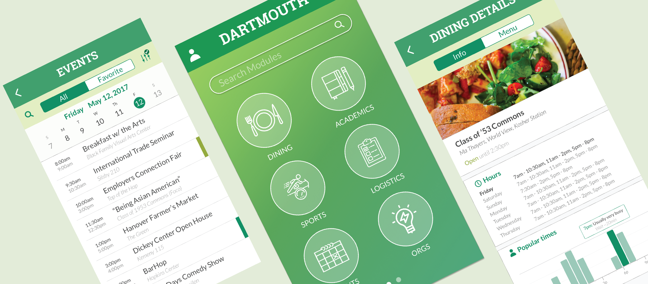
The home page was challenging given the fact that it should operate as an interface that presents all of the major categories in an intuitive and easily navigable way. In the original designs, all the categories were stacked, with no rationale for organization of categories (e.g., size, color, importance of category).
In our design process, we drew inspiration from iOS’s home menu, as well as other interface-based apps. We tried a couple of different iterations before settling on our final design (right). Detailed resources being grouped into macro-level categories, while the search provides an easy way to find embedded modules,
Dining & Events Page
Based on our user interviews, the dining and events pages were some of the most important pages for our users. Despite being central parts of the Dartmouth experience and day-to-day student life, they proved to be large pain points as none of the resources are centralized. Additionally, the content was often times difficult to digest or locate. Some pain points we heard from students include:
''We receive most of our event notifications through blitz [email] - I either flag them in my inbox or have to put them in my calendar right away, otherwise I never know whats going on.”
“It’s always a pain when I’m trying to check the Foco menu… the website is really counterintuitive and cluttered.”
Dining page
Events Page
The main way students find out about events is through Blitz [Dartmouth student email]. Organizations often send emails about upcoming events using gifs/images and multi-colored text in order to get the attention of students.
A major issue is that there is no centralized source or calendar that shows many of the upcoming events. Because of this, students often flag emails or have to manually enter interesting events into their own calendars. However, students are very busy and can see blitzes in passing (e.g., in line at a dining hall, walking in between classes), and do not have time to note down the events - this leads to a number of lost opportunities or inefficiencies when students are trying to plan for events.
Guiding factors
Style guide
Making sure we had a consistent style guide was important because…
we were working across 3 designers (and often had different style preferences)
consistent app experience was high priority given feedback from users
We wanted to make sure that the app felt like a cohesive experience, despite the fact that we used multiple mobile web pages.
Repeatability
Aside from providing a student app for Dartmouth, the app is also meant to be a template which can be applied and used by other institutions. Because of this, one important focus for the app is to make sure that the design is repeatable. We tested a series of color schemes to see if the designs would be conducive to other schools.
Reflections
During my time at Dartmouth, I experienced many of the issues with finding all of the resources we had available - because of this, I was extremely excited to work on the Dartmouth Student App, especially given how closely the goal resonated with me.


